UI Design
Style-Guide
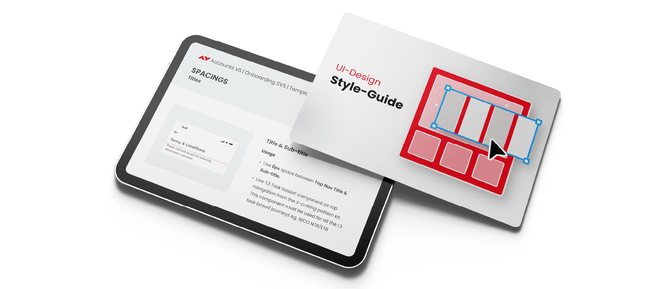
An initiative to create a UI style guide that serves as a central reference point for documenting and aligning all generic, reusable UI layouts, patterns, and interactions to achieve consistency across all the journeys owned by our team. It was meant to guide designers in maintaining visual consistency, layout methods, and design scalability across multiple workflows and scenarios, without introducing heavy level newer design solutions. Ideally, this document would serve as a shared foundation to move the design system build for global usage within the organisation.
- 01
Single reference point for all generic / common UI layouts and patterns
- 02
Provides consistency across all onboarding journeys
- 03
Reduces replication & reuse across onboarding journeys
- 04
Promotes Design Scalability
- 05
Promotes Visual consistency for end users
- 06
Provides brand & system-level design guidelines
- 07
Facilitates Stakeholder alignment during planning and prioritisation discussions
- 08
Saves time & speeds up alignment on new journeys
Document generic / common layouts used across all user journeys to maintain consistency. This document is still in the process to be maintained as per any common changed updates made in the journey or the initial blueprint designs.
Reference context: Accounts VS | Onboarding SVS | Template guidelines for all journeys
1. Title & Sub-Title
Use 8px space between Top Nav Title & Sub-title. Use 12 Task-based component as top navigation from the in-cutting-pattern to label text body and use when the body text is task-based journey e.g. WCO/NTER.
2. Sub-Title & Input Field / Dropdown Component
Use 8px space between Sub-Title & Input Field/Dropdown for consistency. Any component that has a label on top of a field to provide use 24px in between.
3. Illustrations + Title + Body text
Use 8px space between Top Nav & Illustration. Use 8px space between Illustration & Title Direction. The Title already has Top Default bottom padding starting we add 0 from our side.
4. Drop-downs / Input Fields
Use 24px space between other Drop-down / Input Fields, form, fields with labels on top.
5. Input Fields with Character Counter
Use 8px space to the Input Fields (fields below any other component) — use 0 when the input field is on last position from the component.
6. Combination of With & Without Counter
Use 24px space between any fields with a label & character counter content. Use 8px space between any fields with a label & character counter enabled.
Shared illustrations that can be imported from the HSBC Design System that is followed across the organisation. These can be used across all the onboarding journeys to maintain consistency.
Illustration grid — export from Figma node 1:28306
Next project
Logofolio